


So how is Improv like Marketing? Here are the rules that I think are the most illustrative of this new era of marketing and communication.
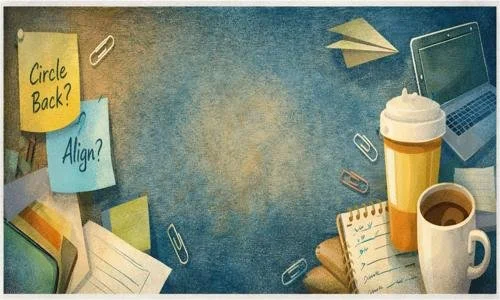
How do you Zoom? 7 Tips for Virtual Meetings.
Outreach resource for area non-profits
Teton Valley Foundation is soliciting non-profits interested in having an informational booth at Music on Main this summer (starts June 18). This is great exposure at a fun and busy community event. The Foundation requests that participating non-profits offer an interactive and educational activity in their booth. Booths go quickly so don’t wait, submit your application today- MUSIC ON MAIN NON-PROFIT BOOTH APPLICATION
Rebranding a State: Oklahoma
I’ve been reading the Skift newsletter lately, which is about the business of travel but also covers travel based marketing campaigns, brand pivots, PR and marketing operations. If you even have a tiny interest in travel, the daily newsletter is a fun read.
This morning I stumbled along Tourist-Hungry Oklahoma Just Rebranded: Did It Get It Wrong?. Besides solid writing, it’s a great anatomy of a branding project with some key take-aways:
Not everyone is going to agree with your results.
Right time. Right place is a huge mystery (see: Nebraska).
Do some research to avoid brand confusion later.
It’s interesting reading about branding successes and missteps. I’m not sure yet which one this is. Do you? My big question is if Oklahoma is where you can pursue your biggest dreams and where entrepreneurship thrives, why did they pick a Canada-based agency over a local one?
Is branding in OK, ok? Let me know in the comments.

Off-Season Resource for Local Businesses
Local media outlet, Buckrail, has compiled dining, wellness and retail deals for the region. Do you have a killer off-season deal at your business? Submit it to Buckrail for inclusion in the guide to earn new business and show the great experience customers can have with your brand.
3 Truths About Networking Events

Maybe you like them. Maybe you hate them. Maybe you’ve never been. Anyway you cut it, there are a few things that always apply to networking events.
1. Networking Events Are Awkward.
Who do I approach first? How do I end this conversation? How can I say hi to Joanie when she is in the middle of that group? Should I have brought a buddy? Why did I bring this person with me? Where do I sit? Where do I stand? Why isn’t anyone here? Why are there so many people here? Did I come overdressed? I don’t have answers to any of these questions. I never will because they come up and loom every time. The good thing is everyone else in the room is going through the same thing.

2. Networking Events Are Not Quick.
I made the mistake of multi-booking on a networking event night, thinking I’d just pop in, see what was going on and duck out.
If that’s the approach, why did I bother anyway? I’m not going to have any meaningful interactions when I’m on a stopwatch. I’m focused on whatever Thing I am doing next, not on being present and meeting a cool entrepreneur, scientist, student, listening and learning. Then after ducking out, I felt guilty at the next Thing, that I should have stayed longer. Rewind and replay track titled “Not Present”.
Events are often not on time or on schedule. Speakers talk longer, guests are late, or the projector’s messed up. Commit to the Networking Event and do that other Thing some other day.
3. Networking Events Work.
If you let it. Be open to who you’ll meet or that person you dread seeing there. Tell your story, but listen to everyone else’s more intently. Have a goal. It can range from “Show up” to “Find a new client.”
So when’s your next one? I plan to enjoy the awkwardness at the next Chance Meeting, coordinated locally by Teton Regional Economic Coalition (TREC) on October 25th.
Logos I love.
I drove to Idaho Falls a few weeks ago to meet with a SCORE mentor . As I cruised down Highway 20, I passed a box truck and noticed its distinctive and simple logo. That’s the inspiration behind my new blog post.
The logo wasn’t particularly creative, or artistic, or inimitable. The company is a disaster restoration and remodeling company. Neither their company nor their logo gives any indication of the type of work they do.
Still, I love this logo.
This logo is all about the relationship between the L & D. I love how it interlocks. The color combination is spot on but not so rigid that it couldn’t change for a brand refresh. It’s clean and bold. It requires no special versions for web, print, banners or other types of materials.
When I got home, I looked up “Davis Restoration Idaho Falls” and it was the #1 result on Google (good job on SEO, gang!) In addition to the logo, Paul Davis Restoration of Idaho also designed some icons to go with their services.
Excuse me while I pass out. I am loving this brand look.
The icons are a great way to tell the damage restoration story. You don’t really know what restoration is until you need it, and since “damage” is one of the top keywords on the site, my guess is that “urgent” and “stress” appear too when the subject comes up. With all that going on, using imagery to explain how the company can help the customer is smart and moves Paul Davis’ prospects along in the buying cycle.
While there are some dramatic images on the site–fire, a roof kissed by a tree, mold damage–these icons serve as a calm, non-judgmental visual reminder of the company’s offering.
What I don’t love.
The company name doesn’t tell me what the company does. It could be an interior design firm (in fact, I thought it was at first glance — due to the look and that it was on a delivery-type box truck), an architecture firm or a real estate agent. The tagline “recover, reconstruct, restore” must always travels with the logo to provide an explanation of the company’s services..
Minor. I’m still drooling over all of it. High-five to the Paul Davis Restoration design team.
Love it or hate it? Logo design is sensitive to people’s individual tastes, preferences and product prejudices. I’d love to hear your take in the comments.
